When it comes to web design, choosing the right color scheme can make a huge difference in the way your website looks, feels, and performs. Colors have the power to evoke specific emotions, thoughts, and feelings in people, and clever use of complementary colors can create a visually stunning and engaging website that is both memorable and effective. In this blog, we will explore the magic of complementary colors and how you can use them to enhance your web design.
Understand color theory and the basics of complementary colors
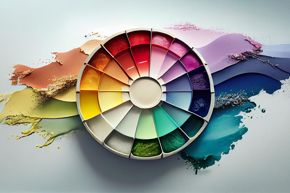
Before we dive into the world of complementary colors, it is essential to have an understanding of color theory and how colors interact with each other. Complementary colors are opposite each other in the color wheel, such as red and green, blue and orange, and yellow and purple. When these complementary colors are paired together, they create a vibrant and dynamic contrast that visually pops. As such, understanding the principles of color theory helps you to choose the best color combinations for your website design.
Consider the mood and feel you want to evoke
Colors can evoke different emotions, and the choice of color schemes can greatly impact the overall mood and feel of your website. For example, warm colors such as reds, oranges, and yellows are often used to create a sense of passion, energy, and urgency, while cool colors like blues and greens can create a calming and relaxing atmosphere. Consider the emotions you want to evoke on your website, as well as the tone and style of your brand. Complementary colors can be a great way to create a specific mood or feel, but be careful not to use too many and risk visual overload.
Use color to highlight important information
Color can be used to grab attention and draw the eye towards important information on a web page. If you need to highlight something, consider using a bright complementary color to create a visual hierarchy and guide the user's eye to what's vital. However, be cautious not to overdo it and ensure that the colors you use are still on-brand and complement your overall design.
Test and refine
When it comes to web design, it is always essential to test and refine your design to ensure that it is both visually appealing and user-friendly. When experimenting with complementary colors, test different color combinations and ensure that they work well in different situations and backgrounds. It is essential to strike a balance between creativity and functionality.
Conclusion
In summary, complementary colors can make a significant impact on your website design, evoking different emotions and feelings in the people who engage with it. Understanding color theory, considering the mood and feel, highlighting key information, and testing and refining your choices are key ways to make the best use of complementary colors. If you need help with your web design in Orlando, FL, Contact REK Marketing & Design to learn more about how we can help you enhance your website, grow your brand, and make the most of your online presence.