Blog Page
| Name |
|---|
Refresh or Rebrand: Which Does Your Orlando Business Actually Need?
The short answer comes down to your leads. If traffic is climbing and the campaign is healthy but you just want a fresher look, you want a refresh. If leads have gone stale or started declining, that is when a full rebrand earns its keep. One protects momentum, the other tries to restart it. Not sure which camp you are in? reach out to our team at (407) 500-0102 and we will tell ... |
When Should Your Orlando Business Market Around a Cultural Moment?
Jump in when the moment genuinely connects to your industry and you can move quickly. Sit it out when the only connection is that everyone else is posting. That is the whole test, and most local businesses get it wrong by forcing a link that simply is not there. Wondering whether a moment is worth chasing? reach out to our team at (407) 500-0102 before you post. At ... |
Google Core Updates and AI Search: How Philadelphia Small Businesses Should Respond in 2026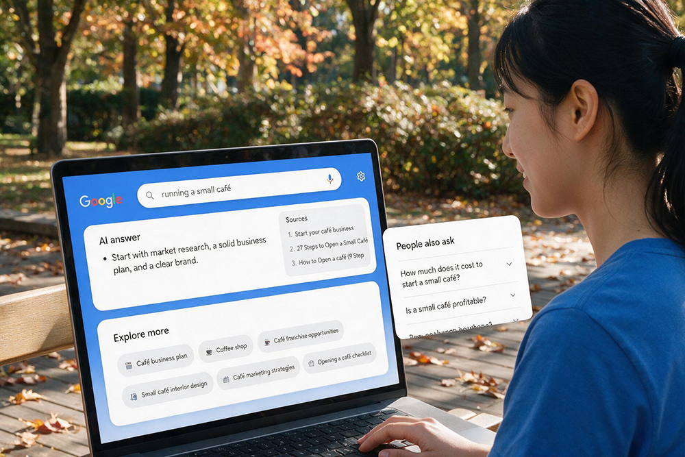
Respond by getting more involved in your own content and by staying calm when your rankings wobble. AI search now rewards the unique perspective only you can give, and most ranking dips after a core update are noise that corrects itself within days. Panic is the real threat, not the update. If a recent drop has you worried, reach out to our team at (407) 500-0102 before you chang... |
The Social Media Metrics Orlando Businesses Should Stop Chasing
Stop chasing likes, views, and comments on content anyone could have Googled. Start chasing engagement on the topics that actually turn into calls. Big numbers on general posts feel wonderful and do almost nothing for your business. The metric that matters is whether the person engaging was ever going to buy. If your social media looks busy but your phone stays quiet, reach out to our team... |
Google Bug Alert: You Can No Longer See Your Review Replies in Google Business Profile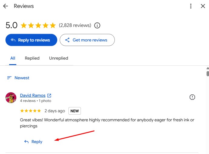
If you replied to a Google review recently and cannot find that reply anywhere, you are not imagining it. There is an active bug in Google Business Profile where the replies you leave on reviews are no longer showing up. It is hitting profiles right now, with no official fix announced yet. If your replies have vanished and you want help telling a real problem from a display glitch, ... |
Is Your Orlando Website Accidentally Hiding From AI? The Crawler Setting Most Businesses Miss
Some websites block AI crawlers without anyone meaning to. A single line in a configuration file, a hosting security setting applied by default, or a robots.txt entry left over from a previous developer can quietly tell ChatGPT, Gemini, and Perplexity to stay out. The AI platforms respect that instruction and never read the site. If they cannot read it, they cannot recommend it, no matter how good the content is. ... |
GEO vs SEO in 2026: Do Orlando Business Owners Need Both, or Is One Enough?
In 2026, GEO does not replace SEO. They run alongside each other, and for most small businesses, dropping either one is a mistake. Traditional search still drives a significant share of buyer behavior, and AI search is growing fast enough that ignoring it is already costing businesses customers. The good news is that the underlying work is largely the same. REK Marketing and Design handles both under one roo... |
How to Get Your Orlando Business Recommended by ChatGPT, Gemini, and Perplexity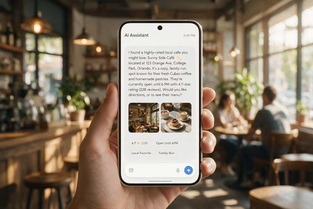
Getting your business recommended by ChatGPT, Gemini, or Perplexity comes down to the same core principle driving Google rankings: demonstrating real expertise, building genuine authority, and earning references from credible sources across the web. The platforms are different. The underlying logic is not. REK Marketing and Design helps Orlando businesses do exactly that, turning what makes them genuinely di... |
Ranking on Google but Invisible in AI Search? Three Fixes for Orlando Businesses
If your business ranks on Google but does not appear when someone asks ChatGPT, Gemini, or Perplexity for a recommendation, the gap almost always comes down to one of three problems: a technical setting blocking AI crawlers from your site, content that is not structured in a way AI systems can parse, or thin off-page authority that gives AI tools no reason to surface you. All three are fixable. REK Marketing and... |